What is a bar chart?
A bar chart is a method of displaying a set of data using rectangular bars where each bar represents a category. Bar charts are the most important tools used in technical analysis. Each bar chart displays a combination of candlesticks depending on the time frame and the frequency.
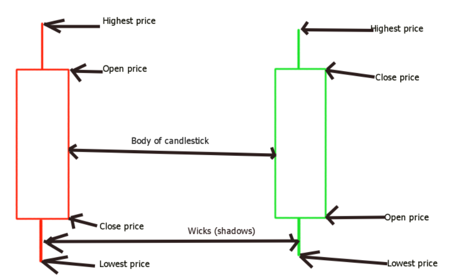
A single candlestick represents a time frame. For example, if you have a daily bar chart, each candlestick will represent the data of a single day. Candlesticks have two main parts which are the body of wicks.
The body of a candlestick is the area between the opening and closing prices.
On the other hand, the wicks are the areas outside of the body. In order words, the upper wick goes from the close to the highest price value a stock reached on a green candlestick or from the opening to the highest value on a red candlestick.
The bottom wick is the area between the open and the lowest value a stock reached on a green candlestick or the area between the closing price and the lowest value a candlestick reached on a red candlestick.
By using a combination of candlesticks on the chart, investors can understand the trend of the stock or security they are interested in.
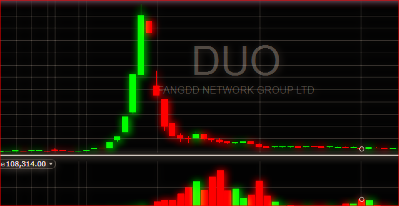
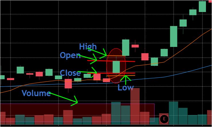
In addition, stock bar charts show the trading volume. You can view the trading volume on a bar chart depicted below.
Ways to represent bar charts
Bar charts can be represented in one of the following ways:
- Horizontal
- Vertical
- Comparative
How do bar charts work?
Bar charts provide the visual representation of sets of data. The data can be continuous (real-time data) or definite. Each chart will have a horizontal axis which is known as the x-axis and a vertical axis a.k.a y-axis. In general, the y-axis represents the value of the data whereas the x-axis represents other values such as time, revenue, cashflows, etc.
Bar charts can also have labels that show specific increments. In addition, it is common for bar charts to have legends that specify different colors where each color represents one group or a group similar data. You can also have 2D or 3D bar charts.
Example of a bar chart

The figure above shows a stock bar chart. The chart shows the candlesticks, labels, and trading volume.
Advantages of a bar chart
The following are some of the advantages of bar charts.
- They show multiple categories at the same time
- Easy to interpret for a quick decision
- Easy to understand
- They clarify the trend of complex data
- Summarize complex data
- They are easy to make
Disadvantage of a bar chart
- They do not provide reasons for a given results
- They require additional interpretation
- Bar charts are easy to manipulate